
Customised 404 pages
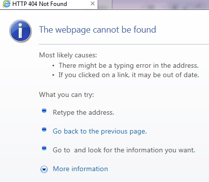
What is a 404 error page?
This is an error shown when you try to visit a page on the internet which isn’t there.
This can happen because:
- You clicked on a link which has been set up incorrectly.
- The page you’re looking for has been deleted.
- You typed in an incorrect address.
Many websites will have 404 pages which are designed to broadly match the look of the website.
Where a defined 404 page isn’t available the browser will display a standard response.
Why should I customise my 404 page?
Hopefully your website doesn’t contain any ‘dead’ links, so visitors won’t see your 404 page very often. However, it will occasionally be seen, and great online marketing means taking advantage of every possible opportunity.
Two important reasons why a customised 404 page is a good thing to have:
- Reinforce your brand
- Provide additional instructions to the visitor
However customised your 404 page is, or isn’t, we recommend ensuring that your web server returns a proper 404 HTTP status code when a missing page is requested, to ensure that search engines don’t index (and therefore display) your 404 page when people search for your business.
Examples of great 404 pages
Here are just a few of the inventive 404 pages you can find and why we like them:
Google’s broken robot

Google’s 404 page is simple but fun. A straight forward message telling you that you’ve hit a dead end, with a cute broken robot trying to fix himself.
LEGO is still awesome
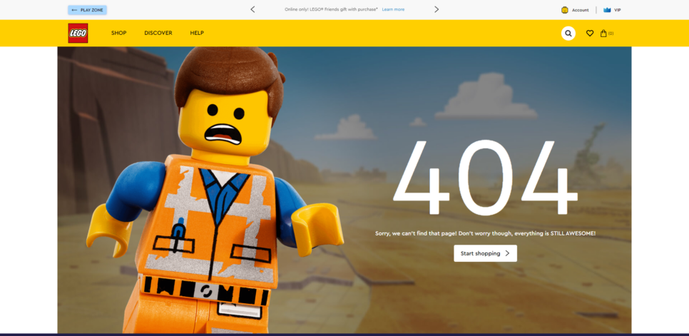
Another fun one is LEGO’s 404 page. Emmet, from the LEGO movies, is in a panic. But the text reassures us that everything is STILL AWESOME.
Taco Bell’s spilt taco
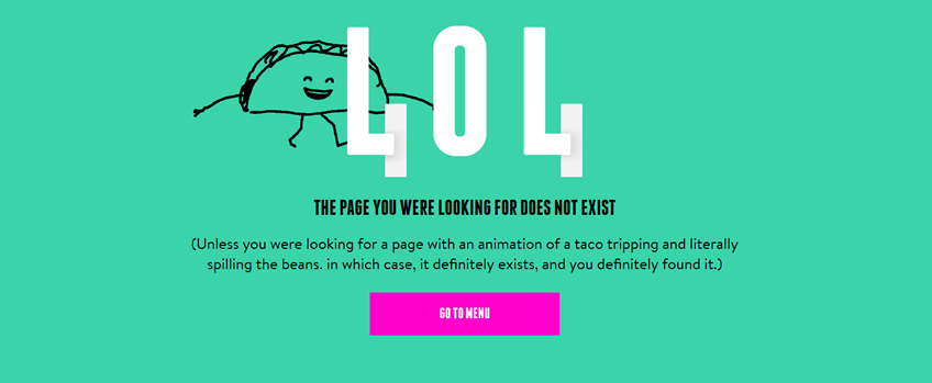
Taco Bell have gone with an animation of a tottering taco, which spills over the 404 message. Makes it worth typing an incorrect address just to watch the poor thing falling over again and again!
Virgin Media’s fun messaging
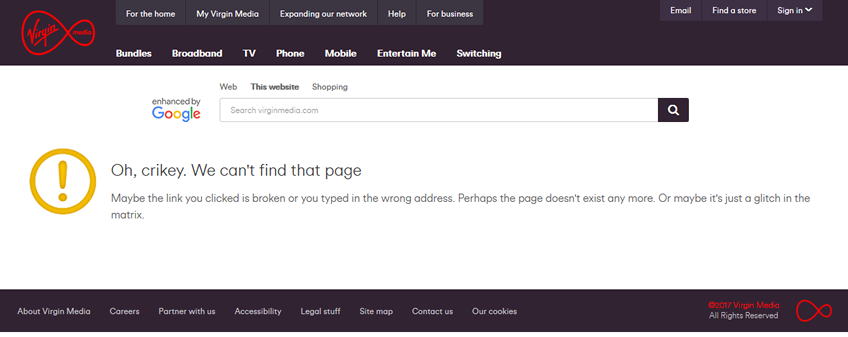
Virgin Media show that you don’t need imagery to create a fun 404 page. The informal tone of their message, and the slightly geeky end reference to sci-fi film The Matrix, tell you everything you need to know about the 404 page, and about the Virgin brand.
Tesco’s dropped egg
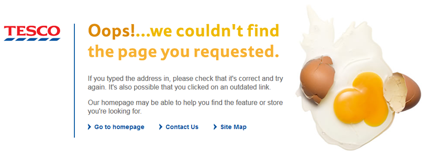
Tesco have gone for a simple but effective broken egg. The text explains how the user might have ended up at the page and gives a few easy options where to go next. This shows that you don’t need expensive bespoke graphics to have a fun 404 page.
British Heart Foundation
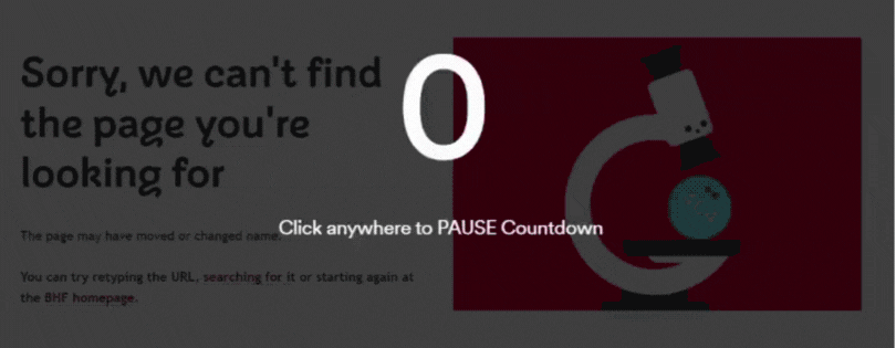
Heart health is a serious subject, but that doesn’t mean that the British Heart Foundation’s 404 page has to be dull. Instead they’ve used an animated microscope character which adds interest to the page while keeping it very much on topic.
Open Door Digital
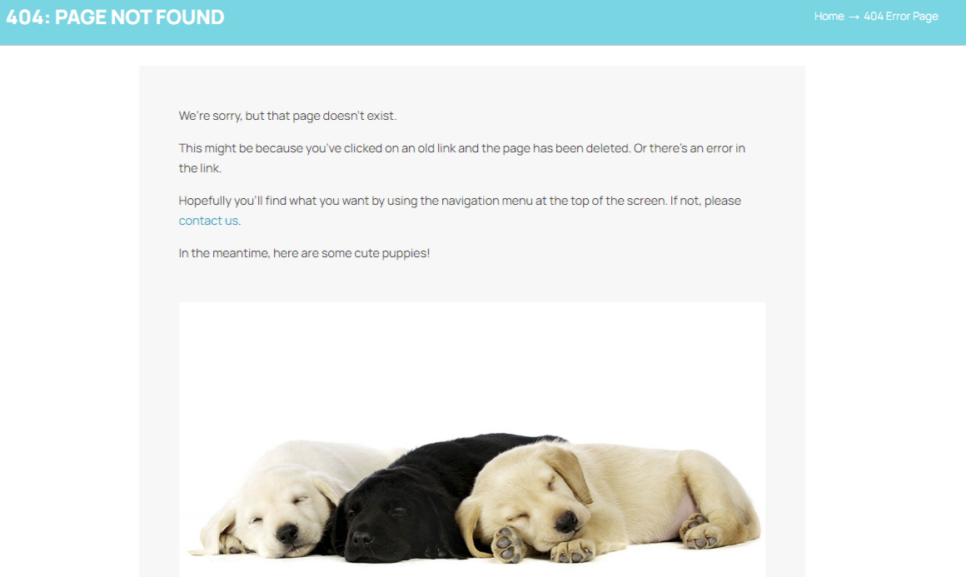
Well, we couldn’t go without showing you our 404 page, could we? We’ve gone cute with this photo of some adorable Labrador pups. So, even if you haven’t found what you wanted, there’s still a benefit in where you’ve ended up!
Is your 404 page letting you down? Ask us about creating something quirky or instructional to suit your brand.